原稿:语雀 · CSS 多栏布局 · 原目录:CSS › CSS 多栏布局
两栏
左侧定宽,右侧自适应
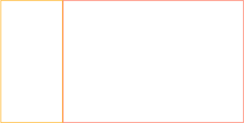
- 左列设置 float,右列使用 overflow:hidden/display:flex 创建 BFC
原理:利用 BFC 不会与 float box 重叠
- 虽然 BFC 不会与 float box 重叠,但实测这句话对于绝对定位元素并不成立
- 设置 display:inline-block/table-cell 时需要显式声明 width,不能算自适应
<style>
  .container {
    height: 400px;
  }
  .left{
    float: left;
    width: 200px;
    height: 100%;
    border: orange 2px solid;
  }
  .right{
    overflow: hidden;
    height: 100%;
    border: tomato 2px solid;
  }
</style>
<body>
  <div class="container">


  </div>
</body>
- 左列 float/positon:absolute,右列保持块级元素,使用 margin-left 向右偏移
原理:利用块级元素会自动填充行内可用空间
<style>
  .container {
    /* position: relative; */
    height: 400px;
  }
  .left {
    /* position: absolute; */
    float: left;
    width: 200px;
    height: 100%;
    border: orange 2px solid;
  }
  .right {
    margin-left: 200px;
    height: 100%;
    border: tomato 2px solid;
  }
</style>
- flex 布局,左列 flex:0 0 width,右列 flex:1
<style>
  .container {
    display: flex;
    height: 400px;
  }
  .left {
    flex: 0 0 200px;
    height: 100%;
    border: orange 2px solid;
  }
  .right {
    flex: 1;
    height: 100%;
    border: tomato 2px solid;
  }
</style>
- 左右列同时 float,右列以 calc(100%-xxx) 作为宽度
原理:浮动元素具有包裹性,利用 calc(100%-xxx) 设置宽度,避免包裹,同时 float box 不会重合
因为标准盒模型下 width 是 content box 的宽度,减去的部分应该是左侧盒子宽度以及右侧盒子除内容宽度外的距离,否则右侧的 float box 就会溢出到下一行
<style>
  .container {
    height: 400px;
  }
  .left {
    float: left;
    width: 200px;
    height: 100%;
    border: orange 2px solid;
  }
  .right {
    float: left;
    width: calc(100% - 208px);
    height: 100%;
    border: tomato 2px solid;
  }
</style>
左侧适应内容,右侧自适应
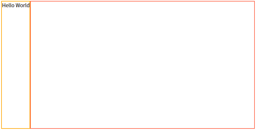
- 左侧 float,右侧 overflow:hidden/display:flex
原理:适应内容依赖于 float box 的包裹性,右侧创建 BFC
<style> .container { height: 400px; } .left { float: left; height: 100%; border: orange 2px solid; } .right { overflow: hidden; height: 100%; border: tomato 2px solid; }</style><body> <div class="container"> <div class="left">Hello World</div> </div></body>
- flex 布局:左侧可以不设置(默认 flex:initial 即 0 1 auto),右侧设置 flex:1
<style>
  .container {
    display: flex;
    height: 400px;
  }
  .left {
    height: 100%;
    border: orange 2px solid;
  }
  .right {
    flex: 1;
    height: 100%;
    border: tomato 2px solid;
  }
</style>
- grid 布局:左侧设置 auto,右侧 1fr
<style>
  .container {
    display: grid;
    grid-template-columns: auto 1fr;
    grid-template-rows: 400px;
    width: 100%;
  }
  .left {
    border: orange 2px solid;
  }
  .right {
    border: tomato 2px solid;
  }
</style>
三栏
参考链接:实现三栏布局的六种方式
左右定宽,中间自适应
圣杯布局
圣杯布局指一种经典的布局,三栏布局出现在它的中间段
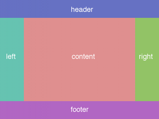
圣杯布局的 html 结构如下,要求中间部分位于 dom 结构优先位置,最先加载
<div class="container">


</div>
container 盒子三栏布局实现思路: 2. 首先要求三列在一行,则需要三列都是 float 元素;同时要求中间自适应,则中间部分 width:100%,但这一步会导致左右两列被挤出当前行


margin-left:-100%:让左列的 left-margin 距离中间列的 right-margin 100% 行宽,即移动到行首 margin-left:-100px:同理,右列的 left-margin 距离中间列 right-margin 100px,即留足自己的位置 |

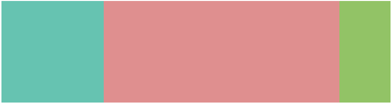
最后,为了完成真正的圣杯布局,需要对 container 部分进行清除浮动的操作,否则 footer 会升到 header 下面,直接设置 overflow:hidder 即可
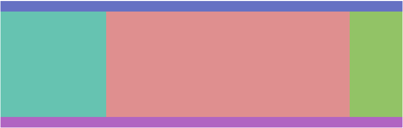
完整代码
/* 圣杯布局 */
.header {
  height: 20px;
  background-color: rgb(102, 113, 195);
}
.footer {
  height: 20px;
  background-color: rgb(176, 101, 194);
}
.container {
  overflow: hidden;
  padding: 0 100px 0 200px;
}
.container .center {
  float: left;
  width: 100%;
  height: 200px;
  background-color: rgb(223, 143, 143);
}
.container .left {
  float: left;
  width: 200px;
  margin-left: -100%;
  position: relative;
  left: -200px;
  height: 200px;
  background-color: rgb(102, 195, 177);
}
.container .right {
  float: left;
  width: 100px;
  margin-left: -100px;
  position: relative;
  right: -100px;
  height: 200px;
  background-color: rgb(146, 195, 102);
}
圣杯布局缺陷:

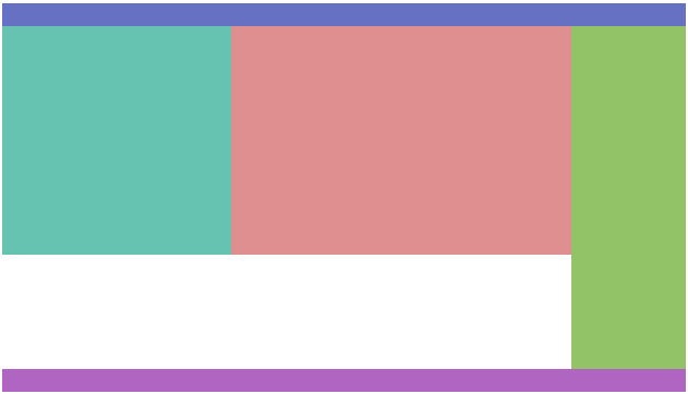
双飞翼布局
在圣杯布局基础上进一步优化,解决了圣杯布局错乱问题,实现了内容与布局的分离;任何一栏都可以是最高栏,不会出问题,header 与 footer 不变, container 的基本 dom 结构如下
<div class="container">
  <div class="center">

  </div>


</div>
- 同圣杯布局相同
- 同圣杯布局相同
- 为 inner 设置 margin-left 和 margin-right,值为左右列宽度;之后的内容都需要写在 inner 块中
inner 类似 ppt 中的文本框,在背景(center)中建立了一块放置内容的独立区域,保证了内容与布局分离 |
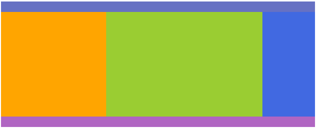
完整代码
/* 双飞翼布局 */
.container {
  overflow:hidden;
  /* 可以设置2*左列宽度+右列宽度为容器最小宽度保证显示效果 */
  min-width: 500px;
}
.container .center {
  float: left;
  width: 100%;
  height: 200px;
  background-color: yellowgreen;
}
.container .center .inner {
  margin: 0 100px 0 200px;
}
.container .left {
  float: left;
  width: 200px;
  margin-left: -100%;
  height: 200px;
  background-color: orange;
}
.container .right {
  float: left;
  width: 100px;
  margin-left: -100px;
  height: 200px;
  background-color: royalblue;
}